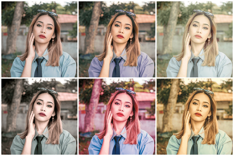
Color grading in photography has become one of the most influential steps of the modern editing workflow. For U.S. photographers, be they hobbyists, content creators, or seasoned professionals, color grading photography is that link between a technically correct photo and the one that feels emotionally charged. In an era defined by cinematic trends, social media storytelling, and highly stylized visual branding, knowing how to manipulate color with the intent of creating a mood is arguably the exact skill that separates the ordinary images from the memorable ones.
Here we will explain what color grading photography really is, how cinematic color works, how tone curves shape emotion, and how LUTs explained in simple terms, can simplify complex adjustments. You'll also learn how editing style creation grows from intentional color choices. By the end, you'll know how to use color grading photography to build powerful emotional narratives in your images.
Color grading photography involves much more than simple editing, like exposure correction or white balance adjustment; instead, it sets the tone of an image. Just like film and cinema, which use cinematic color to help create a certain emotion and feeling for their viewers in a particular scene, color grading photography helps photographers develop tone, personality, and storytelling within an image.
For example:
These are seldom accidental choices. Color graded photography is based on the controlled manipulation of tones, hues, and contrast to achieve a very particular effect. When the visual mood fits the subject matter, the viewer feels more connected with the image.
The cinematic color is now one of the defining stylistic elements of modern photo editing. Pretty much all U.S. photographers are trying to achieve this atmospheric look of movies: rich shadows, balanced highlights, subdued saturation, and purposeful color separation. Cinematic color is not about making your photos look like film stills but about using color to elicit emotion with intention.
The reason cinematic color works so well in tandem with color grading photography is that both have a strong basis in narrative. Together, they direct the viewer to focus on the story rather than the technical details.
Cinematic color focuses primarily on:
Combined with strong composition, the resulting image can be visually powerful, immersive, and meaningful.
Probably among the most common shortcuts in color grading photography are LUTs, or Look-Up Tables. They help photographers apply complex color transformations with just one click. Originating in filmmaking, LUTs have now become a staple among digital creators who want uniformity but with speed.
A LUT is essentially a preset file that remaps the colors of your image to new values according to its formula. The formula can shift tones, alter contrast, boost saturation, or apply cinematic color-all in a matter of seconds.
LUTs in the U.S. are primarily used by photographers to develop their signature style of editing, mainly in portrait, commercial, and travel genres. However, with LUTs, the best mindset is to think of them as starting points that need to be refined with tone curves, HSL adjustments, and then selective color tools to ensure the final look accurately represents the intended mood.
The tone curve is perhaps one of the most powerful color grading photographic tools. It provides detailed control over contrast and brightness across shadows, midtones, and highlights. While sliders are a great place to get beginners started, it's the advanced control over tone curves that's really needed to design cinematic color and emotional depth.
Tone curves set a visual mood, and this occurs in several ways:
For example:
Understanding tone curves is critical in developing your editing style, as the curve dictates the tone and overall mood in an image. How the shadows and highlights interact gives your photo its emotional footprint
 .
.
One point where all great photographers arrive is the development of their signature style in editing. Editing style creation heavily relies on color grading photography, cinematic color decisions, tone curve adjustments, and knowledge of the visual mood you want to convey.
To build a recognizable style:
Behind every adjustment is your choice.
Establish your own LUTs instead of relying on prebuilt ones for consistent editing. As explained earlier, LUTs can be used as the basis for style building. Most U.S. photographers value the creation of an editing style, as this aids in branding, improves trust with clients, and helps create a cohesive portfolio.
Faded, matte, high contrast, or filmic, repetition of similar tone curve shapes creates visual continuity. Skin tones, foliage, sky tones, and shadows all form part of your style. These should be deliberately adjusted.
Color psychology forms a big basis for color grading in photography. Each color has its effect on the viewer's emotional experience. This is just one of many reasons why cinematic color would be so carefully designed in films; every hue lends itself to storytelling.
Here's how common color choices influence visual mood:
Understanding these influences helps photographers make decisions that support the message their image communicates. When you attribute emotional meaning to each adjustment, color grading in photography becomes more strategic.
The power of color grading photography cannot be overstated. It allows photographers to:
Color grading photography is no longer optional but rather one of the cornerstones of modern photography practice.
Color grading photography is an art that turns technically good images into emotionally compelling ones. By understanding how cinematic color influences mood, how LUTs can be explained simply, how tone curves shape depth and drama, and how editing style creation builds consistency, photographers achieve full control over their visual stories.
Mastering color grading photography is one of the primary factors a U.S. photographer should possess in order to create unparalleled aesthetic appeal and therefore deeply affect the viewer. When color becomes meaningful, your work is unforgettable.
This content was created by AI